Basics of Mixing – 6.2 Compressor Operation Principles

Hello, this is Jooyoung Kim, an engineer and music producer.

Today, we’ll discuss the basic principles of how a compressor works.

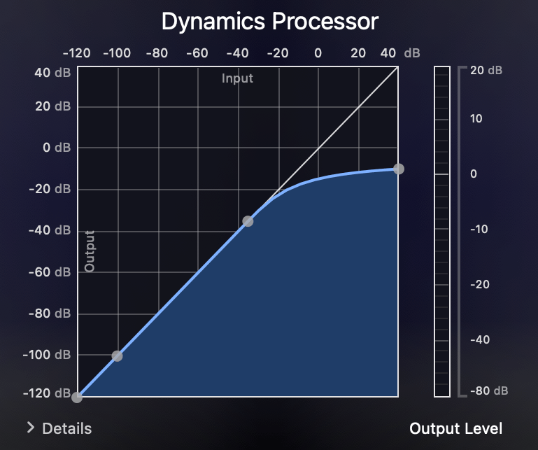
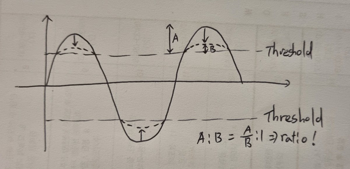
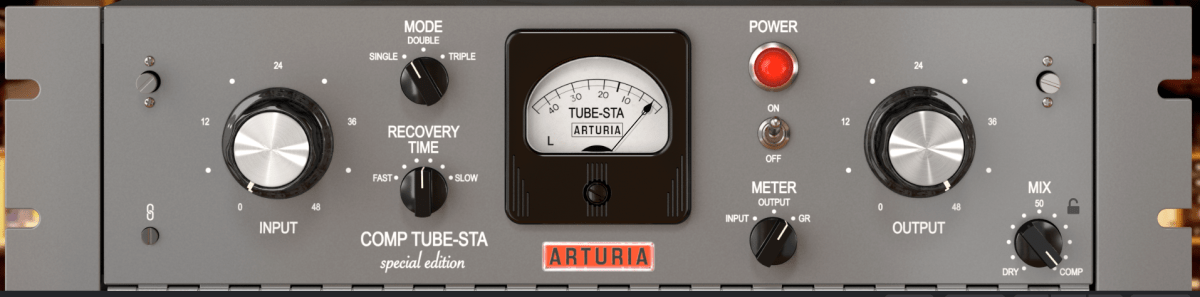
A compressor is a device that reduces sounds exceeding a set volume threshold by a certain ratio.

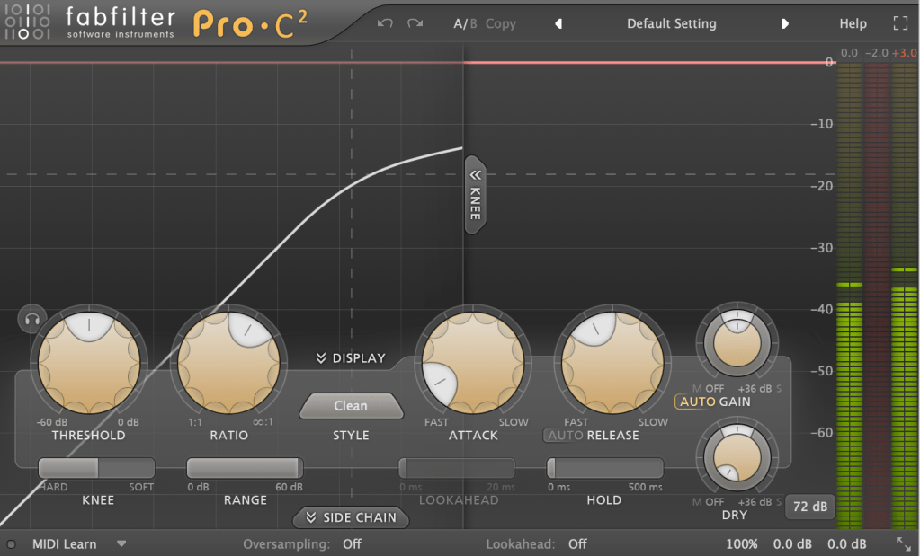
You can set how quickly the compressor reacts when the sound exceeds the threshold (Attack) and how quickly it stops compressing when the sound drops below the threshold (Release).

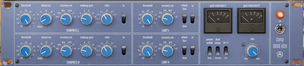
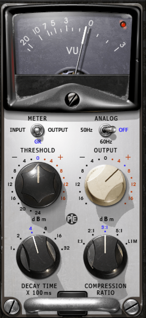
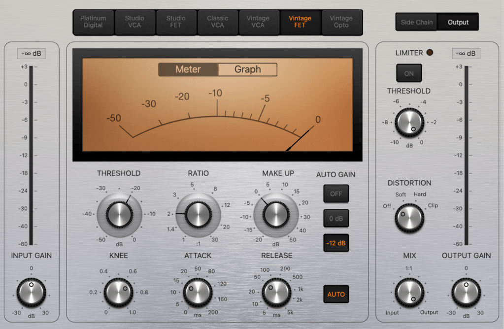
The four basic parameters of a compressor are Threshold, Ratio, Attack, and Release. By making louder sounds quieter and leaving quieter sounds as they are, a compressor helps to level out the volume.

Compressed sounds tend to become quieter. Therefore, to match the volume back to the original level, you use the Output Gain parameter.

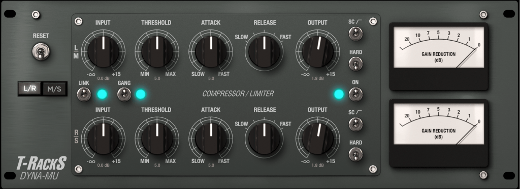
Many compressor plugins have an Auto Gain feature that automatically adjusts the volume, but in my experience, none of them have worked well enough. So, if your compressor has an Auto Gain feature, it’s best to turn it off.

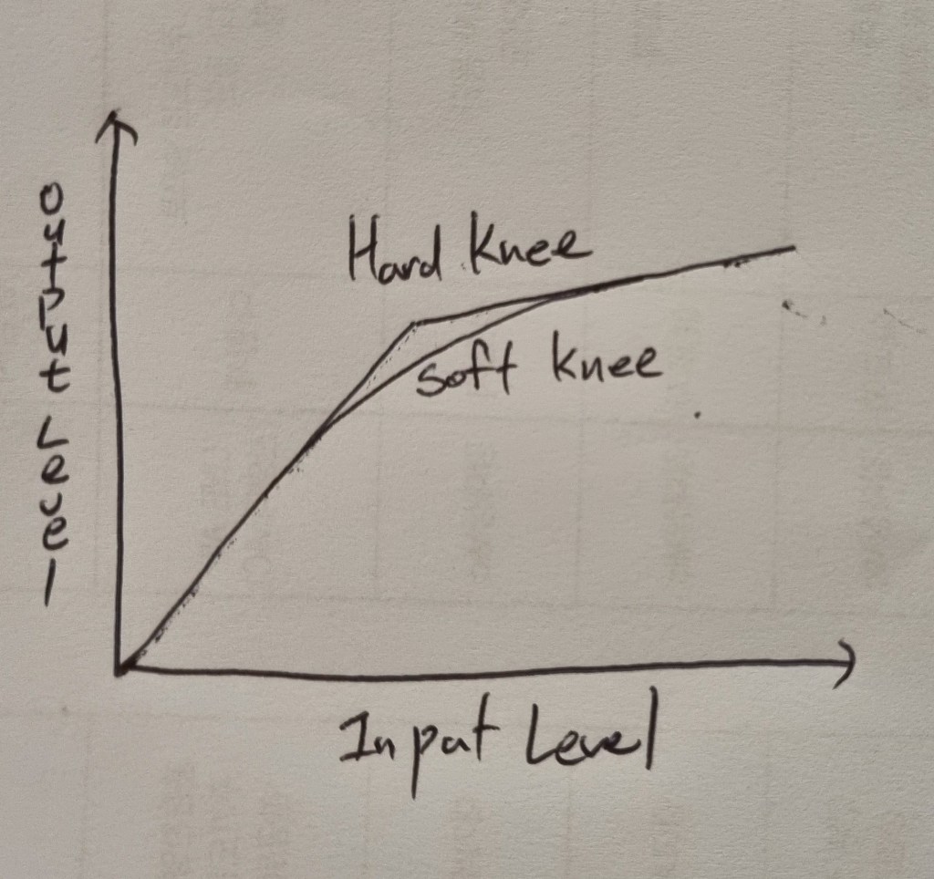
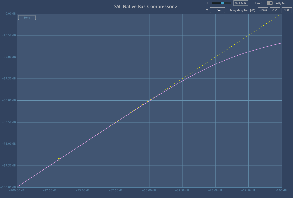
Another setting to consider is the Knee. Hard Knee means the compressor kicks in immediately once the threshold is exceeded, while Soft Knee allows for a more gradual compression as the sound approaches the threshold.

This covers the most basic operation and usage of a compressor.

However, just explaining the parameters and telling you to try them out isn’t enough guidance, right?^^;;

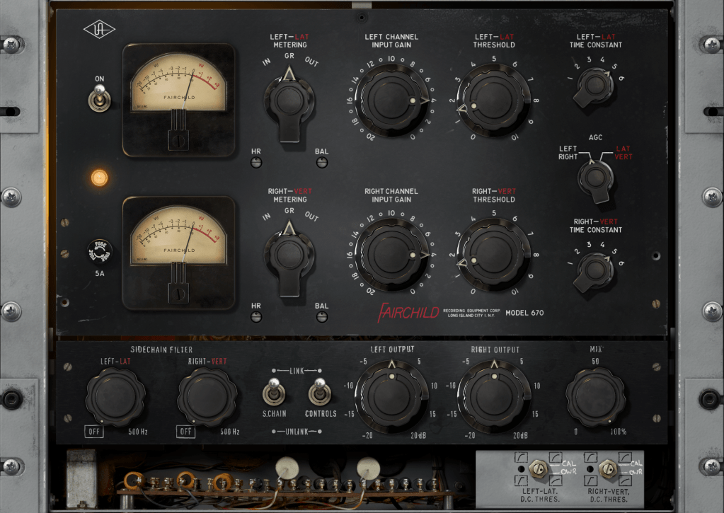
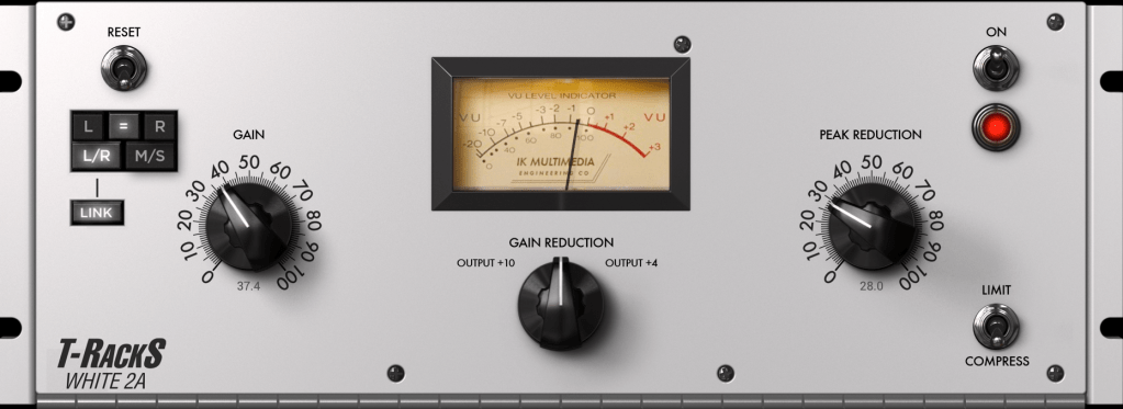
For example, the classic compressor LA-2A has a fixed ratio of 4:1.

Similarly, most versions of the 1176 compressor (excluding the AE version) start with a minimum ratio of 4:1. Starting around these settings can be a good approach.

The appropriate threshold setting varies greatly depending on the desired effect. If you’re new to this and have no idea where to start, try aiming for a Gain Reduction of around -3dB.

Other considerations include:

  1. Setting a fast Attack can change the transient feel of the sound, affecting the instrument’s groove.
  2. Setting a fast Release can cause the sound to pump as it recovers quickly.

Each instrument and sound source is different, so there’s no one-size-fits-all guide. Additionally, many compressors include saturation, which adds coloration to the sound, so various factors need to be considered.

Still, it’s important to start experimenting! By testing out different compressors, you’ll begin to understand which settings work best in different situations.

In the next post, we’ll look at the different types of compressors. Understanding their characteristics will give you a better grasp of how to use them effectively.

See you in the next post!
Basics of Mixing – 6.1 Compressor

Hello, this is Jooyoung Kim, an engineer and music producer.

Today, I’d like to talk about compressors.

Why do we use compressors in mixing?

First, the most fundamental role of a compressor is to level the dynamics.

When the dynamic range (the difference between the loudest and softest sounds of an instrument) is large, it can cause issues where vocals or individual instruments are not clearly heard. It can also result in instruments sounding like they are moving forward and backward in the mix when listening through speakers. By controlling dynamics well, it becomes easier to increase the overall loudness during mastering.

Second, compressors can change the groove of the music.

Depending on when the compressor kicks in and out, and how it compresses, it can alter the groove of the instrument source.

Third, compressors can change the tone of the source through saturation.

Based on the harmonic distortion and frequency response characteristics of the compressor, it can add different textures to the original source.

Fourth, compressors can provide a sense of unity.

A compressor applied to a bus can impart its unique saturation and groove to the entire group of instruments, helping them blend well together.

For these various complex reasons, we use compressors.

In this sixth chapter of Mixing Basics, we will cover:

  1. How to use a compressor
  2. Types of compressors based on their operating principles
  3. Noteworthy compressors
  4. Various other dynamic processors (decompressors, expanders, gates, de-essers, multiband compressors, etc.)

In the next post, we’ll start by discussing how to use a compressor.

Zynaptiq Pitchmap Sale (until July 28)

Hello, I’m Jooyoung Kim, an engineer and music producer.

Today, I want to introduce Pitchmap, a plugin by Zynaptiq that’s frequently used in color bass music.

For this review, I requested an NFR (Not for Resale) code for Pitchmap from Plugin Boutique. Thankfully, Zynaptiq provided me with the ZAP IV bundle code. I’d like to express my gratitude to them. Besides Pitchmap, I’ll be reviewing other Zynaptiq plugins during their sale periods.

Let’s get started!

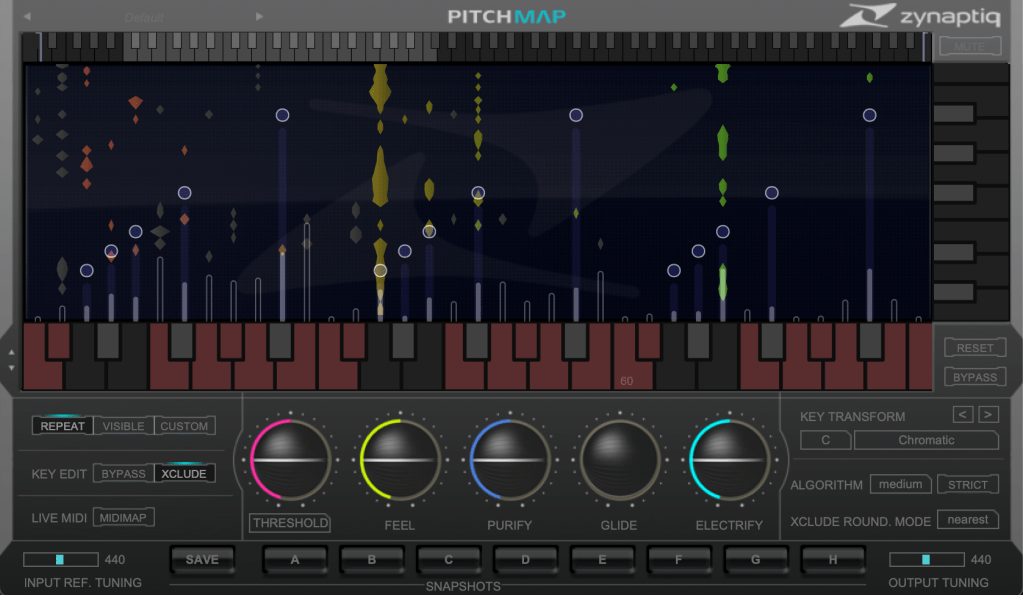
Pitchmap is a pitch correction plugin created by Zynaptiq in 2013.

While pitch correction is commonly associated with vocal tuning, Pitchmap is more often used in remixing and sound design.

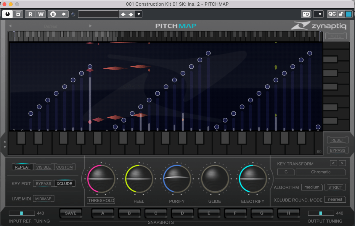
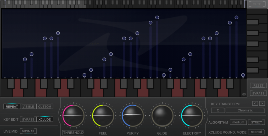
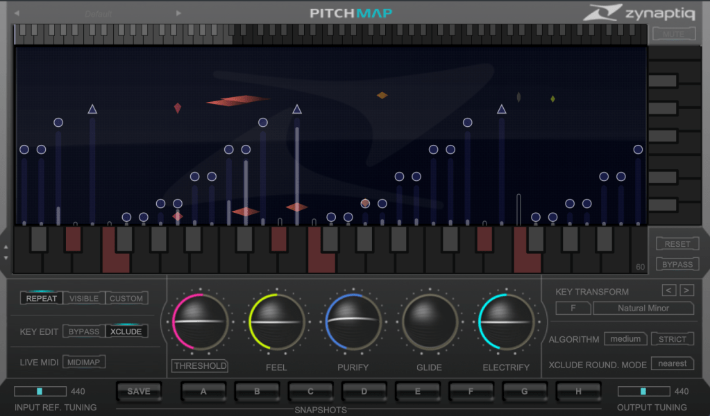
The horizontal axis represents pitch, similar to a keyboard roll.

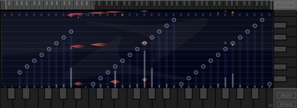
Although only three octaves are shown,

you can adjust the display by clicking the light gray area at the top to navigate to the desired pitch range.

The vertical axis represents time, with red/orange markings indicating the pitch at that specific time. Essentially, the X and Y axes are flipped compared to typical vocal tuning plugins.

The white bars show relative volume, and the circles indicate pitch shifts.

For example, moving a circle representing F# upwards changes the sound from F# to G.

This allows you to change the key of the entire piece arbitrarily.

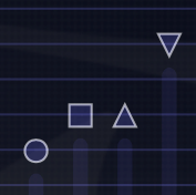
Double-clicking on a circle transforms it into various shapes: inverted triangle, triangle, square, etc.

  1. A square maintains the pitch within the same octave.
  2. A circle shifts to the nearest pitch (up by 9 semitones or down by 3 semitones).
  3. An inverted triangle always shifts downwards.
  4. A triangle always shifts upwards.

In Key Edit mode, you can click on notes in the piano roll to exclude them from playback.

Clicking Bypass and selecting notes in the piano roll means those notes will bypass the effect.

You can also allow MIDI input to select pitches in real-time through a MIDI channel.

You might wonder if these changes would make the sound awkward, but surprisingly, the result is quite cohesive, making Pitchmap ideal for remixing.

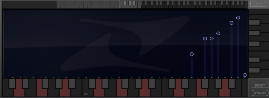
The white bars in the top piano roll can be moved to set a specific pitch range. The image above sets the range from Eb downwards to be excluded.

Other parameters include:

  1. Threshold: Determines the extent of tuning (lower values mean more comprehensive processing).
  2. Feel: Controls subtle pitch variations after tuning (higher values retain more nuance).
  3. Purify: Reduces noise above 50% and increases noise below 50%.
  4. Glide: Adds glide/portamento effects.
  5. Electrify: Enhances the synthetic feel or optimizes signal processing.

Exploring the rest of the features will help you understand their functionalities better.

This plugin is not only useful for contemporary music, often centered around remixes and bass, but also for creating unique sounds in other genres. Personally, I enjoy blending these elements into string or band sections for a sophisticated and effective sound.

I’ll share some YouTube videos demonstrating how I use Pitchmap.

The current sale lasts until July 28, and the discount is substantial. If interested, I highly recommend purchasing.

Additionally, purchasing from Plugin Boutique entitles you to a free plugin. This month, the options are Frostbite 2 by AudioThing or EQuivocate by Newfangled Audio.

Frostbite 2 offers various modulation effects, and EQuivocate is a graphic EQ with auditory filters and a Match EQ feature. Personally, I’d choose Frostbite 2.

See you in the next post!

Choosing Speakers by Reading Spinorama Charts!

Hello! this is Jooyoung Kim, an engineer and music producer.

Today, I’d like to explain Spinorama, a concept anyone interested in sound and speakers should know. Let’s get started!

Example of a Spinorama Graph

First, let’s briefly look at the history of how Spinorama measurements were developed.

Spinorama was created in the 1980s by Dr. Floyd Toole, a leading authority on speaker acoustics, while he was working at the National Research Council of Canada. In the 1990s, it was further refined in collaboration with Harman International. It has since been incorporated into standards issued by the American National Standards Institute (ANSI) and the Consumer Electronics Association (CEA).

Standard Method Of Measurement For In-Home Loudspeakers

The measurement process, as shown above, involves taking measurements every 10 degrees horizontally and vertically in an anechoic chamber, resulting in a total of 70 data points.

This looks intense…

The collected data is represented in six frequency response graphs known as Spinorama charts.

KEF R3 META

Let’s look at the Spinorama graph for my recently purchased KEF R3 META. The vertical axis is dB SPL (the unit we often use to measure sound levels, like airplane noise), and the horizontal axis is Hz (the unit of frequency).

  1. The top blue line is the On Axis response, representing the frequency response directly in front of the speaker. Manufacturers commonly provide this graph, but it lacks comprehensive information.
  2. The second orange line is the Listening Window response, which averages the frequency responses from ±10 degrees vertically and ±30 degrees horizontally, totaling 9 measurements. This approximates the expected response in a typical listening environment.
  3. The third red line represents Early Reflections, showing the response of early reflected sounds. It averages 8 measurements taken at ±40, ±60, and ±80 degrees horizontally, and ±50 degrees vertically. A significant difference from the On Axis and Listening Window responses helps distinguish between direct and reflected sounds.
  4. The light blue Sound Power response averages all 70 measurements. The more this graph parallels the other graphs without significant fluctuations, the better the speaker’s acoustic performance.
  5. The green Early Reflections DI (Directivity Index) is the difference between the On Axis and Early Reflections responses. This graph helps to quickly understand the difference between direct and reflected sounds.
  6. The brown Sound Power DI is the difference between the On Axis and Sound Power responses. Research suggests that smoother changes in both DI graphs are preferred by listeners (I’d provide the exact study, but finding it would take some time… I’ll update if I come across it later).
Genelec 8351B
  1. The On Axis chart shows the basic frequency response.
  2. The closer the Listening Window response is to the On Axis response, the more similar the sound will be for the listener and those around them. This indicates good off-axis performance, meaning the sound remains consistent even if the listener moves slightly.
  3. The more aligned the Early Reflections, Sound Power, and On Axis graphs are, the higher the preference among listeners. If it’s hard to judge, check the DI graphs for a consistent slope.

This gives a basic understanding of Spinorama charts.

Of course, Spinorama charts have their limitations. As the title suggests, you shouldn’t choose a speaker based solely on these charts. However, they are a fundamental indicator for understanding a speaker’s performance, making them valuable knowledge for anyone in music or sound.

In future posts, I’ll discuss near-field measurements by the German company Klippel.

Finally,

https://www.spinorama.org/

This site offers Spinorama charts for many speakers measured so far. Since it aggregates data from various sources, make sure to choose highly reliable sources in the settings tab for accurate information.

I hope this post is helpful for you! See you in the next post!